Articles
Ecommerce insights, guides, and best practices from our team.

Bigcommerce Platform Limits
As an e-commerce business owner considering BigCommerce as your platform of choice, it’s essential to understand the platform’s limitations to \[…\]

5 Easy Ways to Discover Unique Content Ideas for Your Ecommerce Blog
One of the most effective ways to maintain a reliable flow of customers is through a search-engine optimized ecommerce blog. \[…\]

Blogging for Ecommerce: Boost Your Sales with Content Marketing
Blogging has become an essential part of e-commerce marketing strategies. It is a cost-effective way to attract and engage potential customers, establish \[…\]

The 17 Best AI Image Upscalers of 2023 (Enhance and Upscale Photos by 800%)
In the digital age, where visuals play a pivotal role, the quality of images can make or break an impression. \[…\]
Best Black Friday Subject Lines: 175+ Examples and Ideas for 2024
Ever wondered why some Black Friday emails grab your attention while others get lost in your inbox? With Black Friday \[…\]
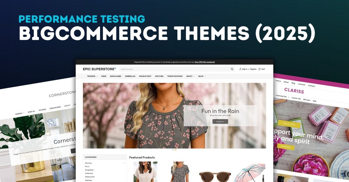
BigCommerce Theme Performance Analysis
When it comes to ecommverce success, site performance is no longer optional. A slow-loading store can mean the difference between \[…\]
51 Black Friday Email Marketing Ideas for 2024
Black Friday isn’t just a day; it’s a phenomenon, especially in the world of ecommerce. For online store owners, it’s a \[…\]
![Best Black Friday Hashtags: Boost Your Holiday Sales [2024]](https://pub-9feb8f03f14c480ea76c20805e41b035.r2.dev/images/cmm8iormz0001qtddyyi8yi2x/black-friday-hashtags/680aeb90b92b.jpg)
Best Black Friday Hashtags: Boost Your Holiday Sales [2024]
Have you ever wondered how some small businesses manage to dominate social media feeds during Black Friday? It’s not just \[…\]

Choosing the Right eCommerce Platform for Your Business in 2023
In the age of online shopping, choosing the right eCommerce platform for your business is more crucial than ever. A \[…\]
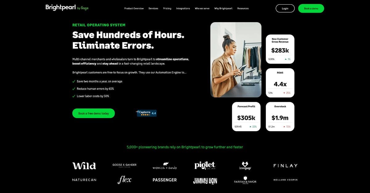
Brightpearl Review: Managing Inventory for Shopify and BigCommerce Stores
As e-commerce businesses expand their operations across multiple sales channels, the complexity of inventory management increases exponentially. At this growth \[…\]
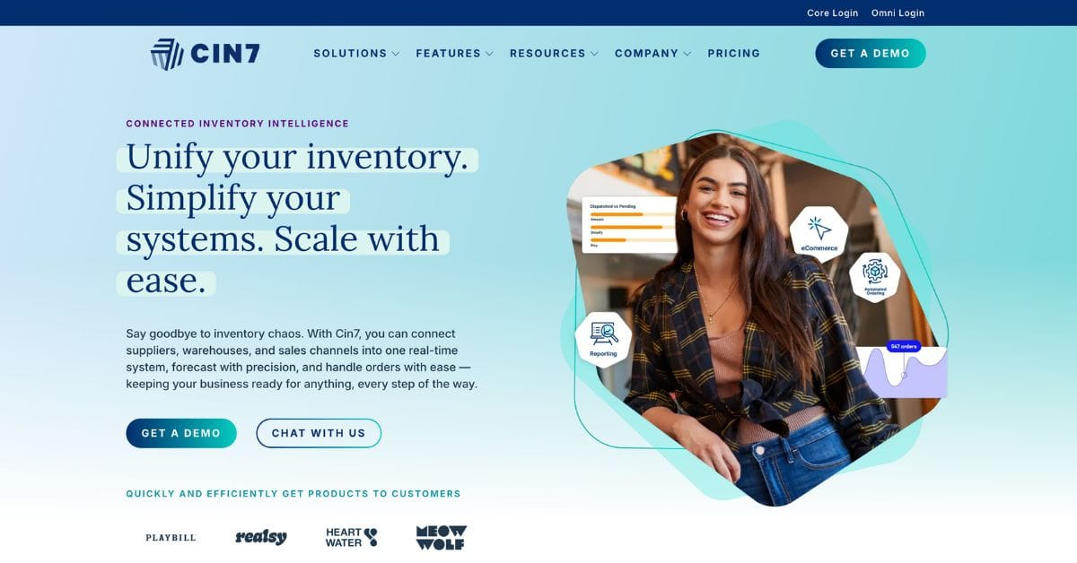
Cin7 Inventory Review: Managing Inventory for Shopify and BigCommerce Stores
As e-commerce businesses grow across multiple sales channels, inventory management becomes increasingly complex. Shopify and BigCommerce merchants often reach a \[…\]

Ecommerce Migration Checklist: Your Essential Path to a Successful Move
Are you risking operational disruption and customer trust loss by not having a strategic ecommerce migration checklist in place? Starting \[…\]
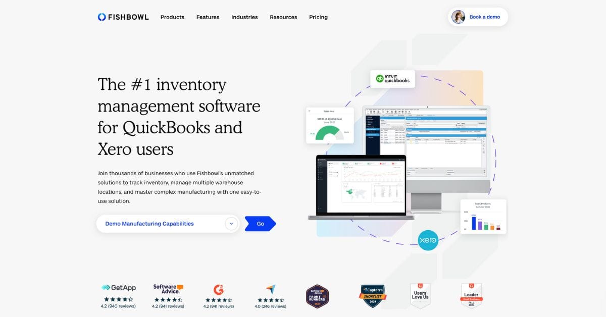
Fishbowl Inventory Review: Managing Inventory for Shopify and BigCommerce Stores
For e-commerce businesses utilizing platforms like Shopify and BigCommerce, effective inventory management is crucial to maintaining customer satisfaction and operational \[…\]

How to Build Trust in Ecommerce Stores
Ever wondered why some ecommerce sites win your trust while others don’t? In today’s digital world, trust is key. Adobe’s \[…\]

How to Prepare for Black Friday: the Ecommerce Prep Guide
Are you ready to capitalize on a potential $9.3 billion Black Friday weekend? With consumers spending more and demanding faster \[…\]

How to Tell What Ecommerce Platform a Site is Using
Ever wondered which ecommerce platform your favorite online store uses? Knowing this can give you insights into their capabilities. It’s \[…\]

How to Reduce Returns in Ecommerce
Ever thought about why so many online buys end up back in warehouses? It costs businesses billions each year. In \[…\]
New App | Epic Page Builder Widget for BigCommerce
Over the last 15 years, Epic Design Labs has been known as a premier BigCommerce agency –creating top notch ecommerce \[…\]
Optimizing Your Shopify Store for Peak Performance
Speed matters. A one-second delay in page load time can reduce conversions by 7%. Here's how to make your Shopify store lightning fast.
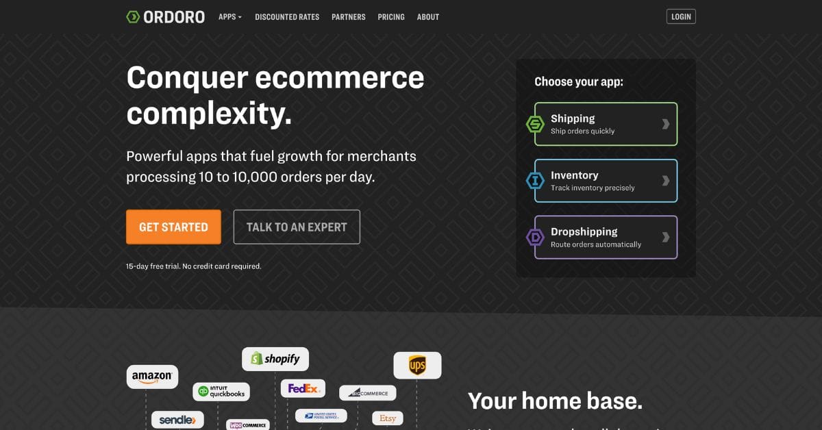
Ordoro Review: Inventory Management System for Dropshippers
For e-commerce businesses operating on platforms likein Shopify and BigCommerce, managing inventory and streamlining fulfillment processes become increasingly challenging as \[…\]
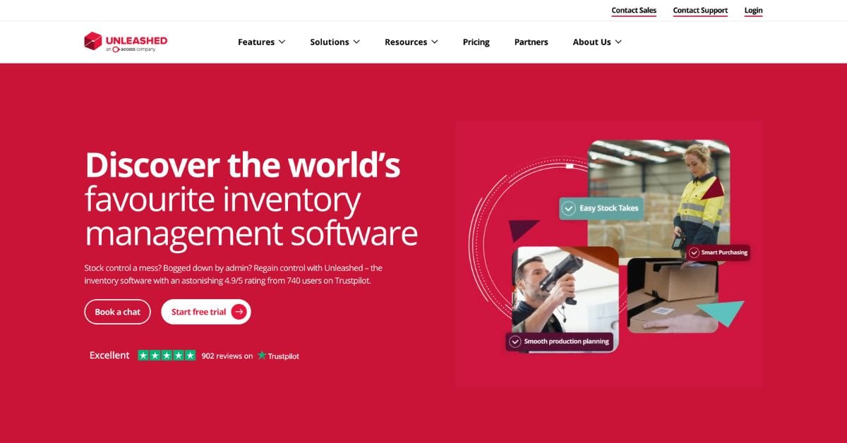
Unleashed Inventory Review: Managing Inventory for Shopify and BigCommerce Stores
For growing e-commerce businesses using Shopify and BigCommerce, the transition from basic inventory tools to a comprehensive inventory management software \[…\]

What is Headless Ecommerce?
E-commerce is expanding in today’s digital world. Therefore, firms must give their customers outstanding purchasing experiences. Yet, as it calls \[…\]
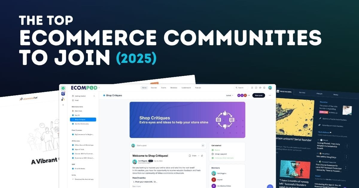
Top Ecommerce Communities for 2025 Every Store Owner Should Join
Running an ecommerce business can often feel like a solitary journey. While you’re busy managing inventory, optimizing your store, and \[…\]
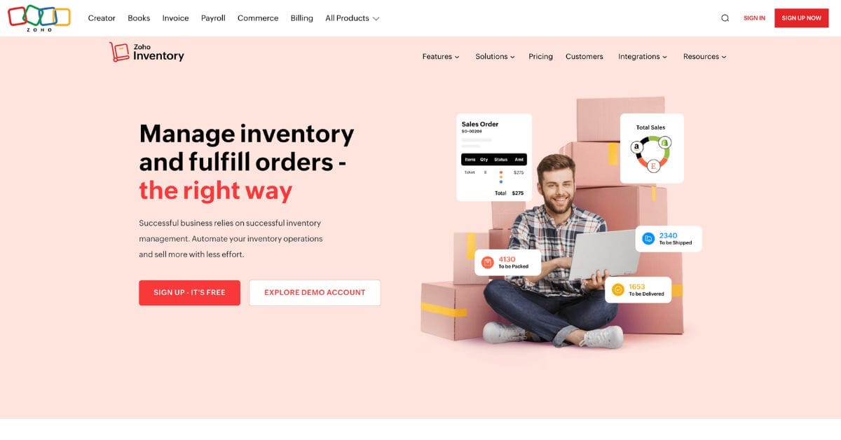
Zoho Inventory Review: Managing Inventory for Shopify and BigCommerce Stores
For small to mid-sized e-commerce businesses operating on Shopify or BigCommerce, managing inventory efficiently while keeping costs under control can \[…\]