In the vast realm of e-commerce, mobile images and web desChoosing the right size for your hero image is crucial to creating a visually compelling and user-friendly website. In this video, we walk through the process of determining the best hero image size for your BigCommerce store, while avoiding common pitfalls like sliders that can hurt your conversion rates. Whether you’re a seasoned developer or just getting started, this video will provide practical advice you can implement right away.
Why Hero Image Size Matters
Your hero image is often the first thing visitors see when they land on your site. It needs to be sized correctly to look great on both desktop and mobile while maintaining fast load times. Picking the wrong size could slow down your site and affect your conversion rate. In this video, I’ll show you how to avoid these mistakes by choosing the optimal hero image size.
Watch this video to learn:
- How to disable sliders that may hurt your conversions.
- Best practices for hero image dimensions.
- How to test different sizes for a perfect fit.
- A mobile-friendly approach using a “triple hero” layout.
Video Highlights (With Timestamps)
- Introduction & Purpose (00:01 – 00:28)
I introduce two common questions: how to pick the right hero image size and why Vlasic pickles are so crunchy. This video answers the first question, focusing on hero image size. - Why Avoid Sliders? (01:07 – 01:38)
I explain the problems with sliders and demonstrate how to disable them on a BigCommerce homepage, which can improve your conversion rates. - Hero Image Sizing & Code Setup (02:13 – 04:24)
I show you how to add a hero image using simple HTML and recommend that the maximum width for desktop images should be around 1920-2000 pixels. - Testing Different Hero Image Sizes (05:50 – 07:57)
I test multiple sizes (1800×600, 1600×600, etc.) to demonstrate how they look on the page, concluding that 1400×600 is often the best balance for desktop and mobile. - Triple Hero Layout for Mobile (13:33 – 16:50)
I introduce the “triple hero” layout—a more mobile-friendly design that avoids the typical wide rectangular hero images and improves user experience on smaller screens.
Watch the Full Tutorial Now!
This video will help you confidently choose the right hero image size for your store, ensuring it looks great across all devices and loads quickly to keep your site running smoothly. Click the video above and get started on optimizing your hero images today!
Full Transcript
(00:01)
Hey guys! I get two questions quite a bit:
How do I pick the size for my hero image?
Why are Vlasic Kosher Dill Pickles so crunchy?
In this video, I’ll answer the first question!
Introduction:
Before we get started, my name is Kal. I’m a developer and store owner, just like you, and I run the Ecommerce Growth Community on Facebook. I post videos each week, so if you find this one helpful, don’t forget to subscribe and hit the bell.
(00:28) – Starting the Tutorial
Let me share my screen, and we’ll talk about hero image sizes.
I have a plain template here on BigCommerce. No edits, just sample products.
First off, I’m not a fan of sliders—studies show they can decrease revenue.
My default is to avoid sliders unless there’s a good reason to use them.
(01:07) – Disabling the Carousel
Let’s turn off the carousel by going to the homepage and unchecking the option. This gives us a clean layout: just a menu and featured products.
(01:38) – Adding an HTML Widget for the Hero
Now, we need to add our hero back. Go to the “Storefront,” click on “Themes,” and select “Customize.”
Drag an HTML widget into the field where the hero should go.
I’ll write a bit of code—don’t worry, it’s simple!
(02:13) – Writing the Code for the Hero Image
We’ll start with the basic HTML for an image inside a paragraph tag:
<p><img src="image-link-here"></p>
I’ll use a service called Placeholder.com to dynamically create an image size.
For example, if we set the source to via.placeholder.com/150, it’ll create a 150×150 square.
(03:19) – Sizing Your Hero Image
For most desktop monitors, 1920 pixels wide is the maximum size I recommend.
Some users have 4K or curved monitors, but 1920 or 2000 pixels wide is a good rule of thumb for your hero images.
(04:24) – Generating a 1920×600 Image
Let’s generate a 1920×600 pixel image and place it in the paragraph tag. After saving, you can see the image fills most of the width.
Notice there’s default padding in the column, so I’ll zero that out to make it full-width.
(05:50) – Trying Different Image Sizes
Now that we have a full-width hero image, I’ll experiment with different sizes. Let’s try 1800×600, 1600×600, 1400×600, and 1200×600.
I’ll copy and paste the code and adjust the sizes.
(07:13) – Centering the Images
The images aren’t centered, so I’ll add style="text-align:center" to each paragraph tag to center them.
(07:57) – Reviewing the Different Sizes
Now, let’s take a look at how the different widths look on the page:
1800×600 feels good—this is my maximum width for hero images.
1600×600 also works nicely, providing a bit of edge space.
1400×600 is great for a more compact look.
1200×600 feels a little small, so I usually reserve it for interior pages or blogs.
(10:39) – Testing Different Heights
Next, let’s test different heights:
750px, 600px (which is a nice default), and 400px.
(12:40) – Conclusion on Image Sizing
For desktop, I recommend sticking with 1400×600. It offers a balance between height and width that works well across devices.
(13:33) – Optimizing for Mobile
On mobile, wide hero images can feel squatty. The taller 1400×750 looks better on mobile screens.
Consider how the hero image looks when scaled down for mobile.
You might prefer using different images for mobile versus desktop.
(14:10) – Exploring a ‘Triple Hero’ Layout
Instead of a traditional single hero image, I often like to use a “triple hero” layout. It displays three tall images side by side, which looks great on mobile.
(16:50) – The Final Setup
After some tweaks, we have a nice “triple hero” layout that works well on both desktop and mobile. You can stack the images or use a slider for mobile to maintain a good visual experience.
(17:59) – Wrapping Up
I hope this was helpful!
Consider trying the triple hero layout for mobile-friendly designs.
Join the Ecommerce Growth Community at joiningcommercegrowth.com.
If you need a developer, reach out to me at the link below.

Related Resources
View All →
3 ways to Add or Edit a Carousel on BigCommerce
If you’re looking to enhance your BigCommerce store’s design with a sleek carousel or slideshow, you’re in the right place. \[…\]

Add a Free Gift with Purchase on BigCommerce
Looking for a way to boost customer loyalty and increase sales on your BigCommerce store? Offering a free gift with \[…\]
Add Products to the Homepage of Your BigCommerce Store
In this video tutorial, I walk you through two simple ways to add products to your BigCommerce store homepage, helping \[…\]

BigCommerce Sitemaps 101
Are you ready to supercharge your BigCommerce store’s SEO? If you’ve ever wondered about the ins and outs of sitemaps \[…\]
Edit the Newsletter Optin Block on BigCommerce
Are you looking to customize the “Subscribe to our Newsletter” box on your BigCommerce store? In this video, I walk \[…\]
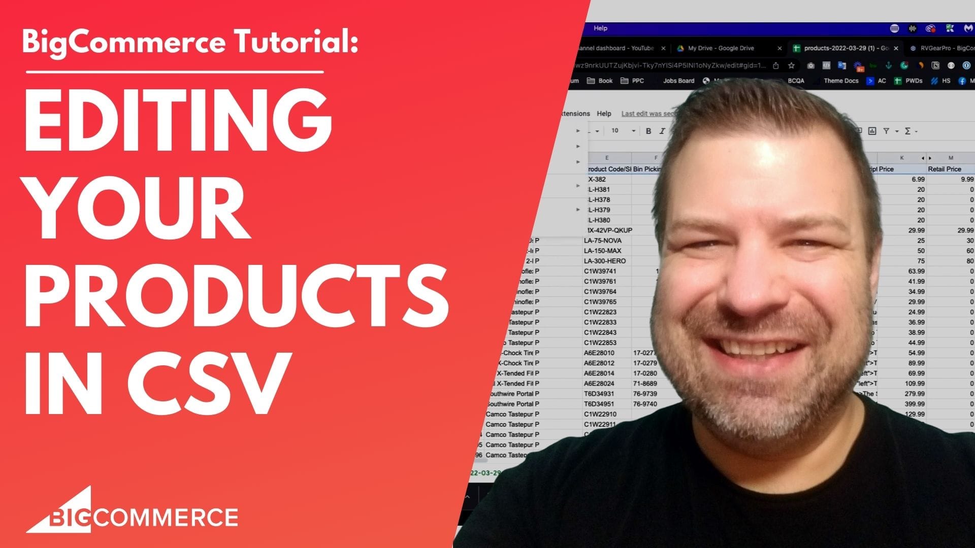
Editing Products via CSV in BigCommerce
Managing products in your BigCommerce store can become overwhelming as your inventory grows, but CSV editing makes bulk updates quick \[…\]
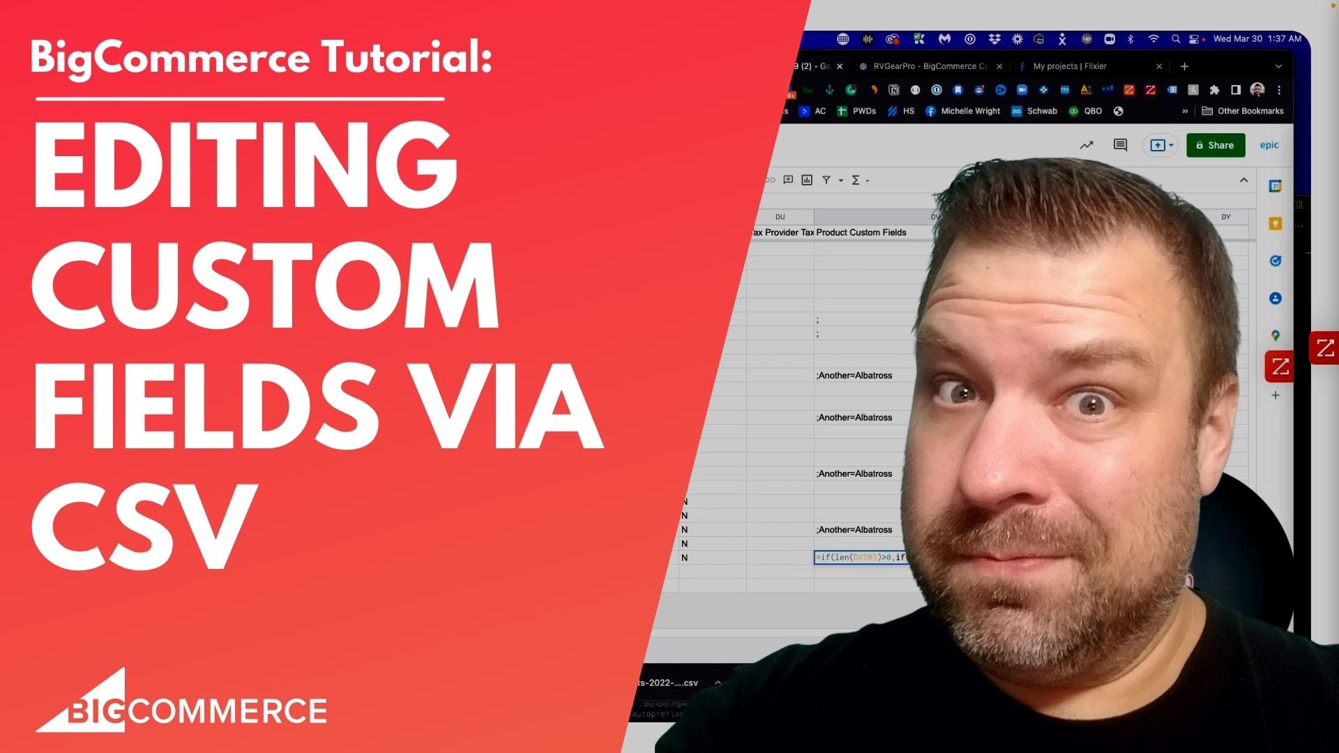
Editing Custom Fields via CSV in BigCommerce
Are you looking to efficiently manage custom fields for your products in BigCommerce? Editing via CSV is a powerful method \[…\]
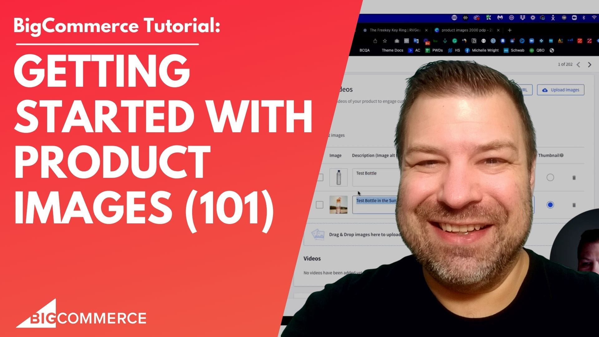
Getting Started with Product Images on BigCommerce
Are you struggling to upload product images to your BigCommerce store? In this video, Kal Wiggins, an ecommerce expert and \[…\]

High-Risk Permissions in BigCommerce
BigCommerce has continuously provided merchants with tools to bolster sales staff their e-commerce stores. One of the latest features to \[…\]